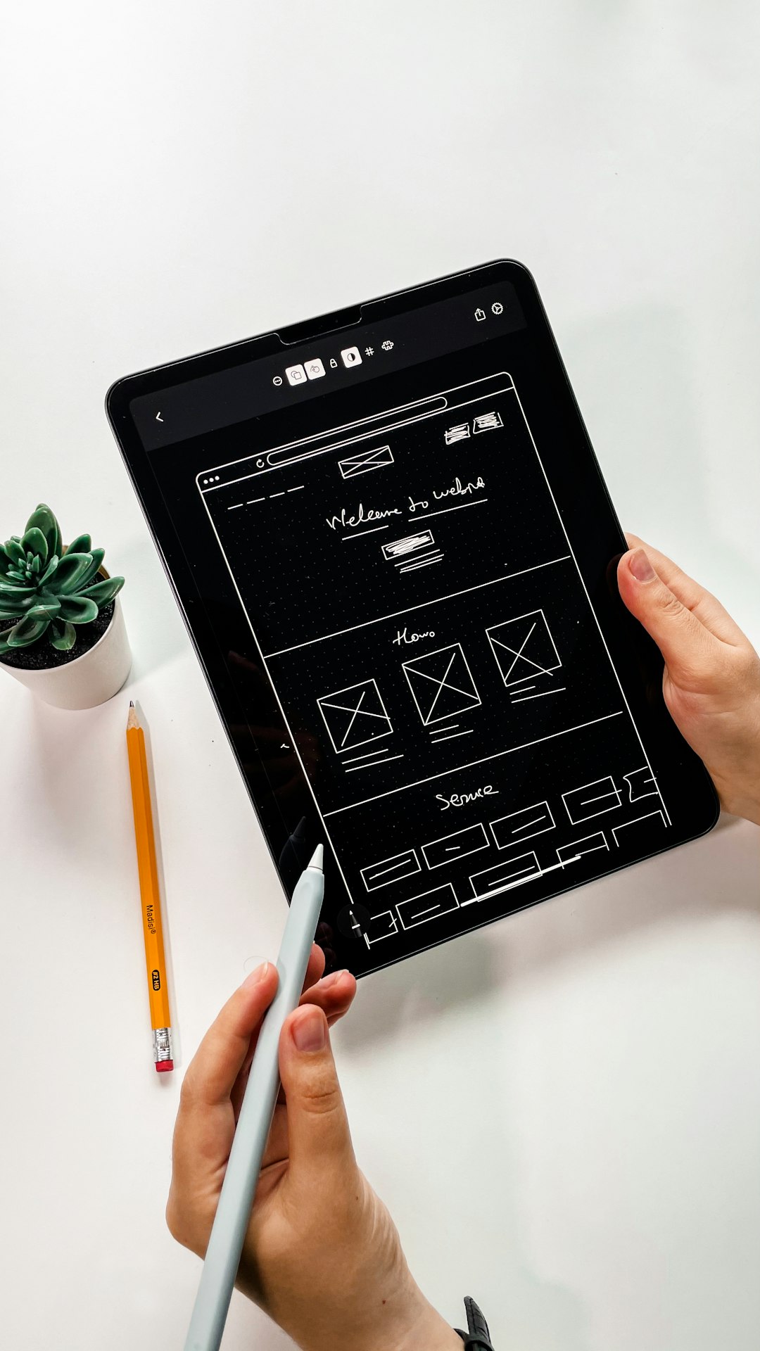
In today's multi-device world, creating websites that function well across a spectrum of devices isn't just good practice—it's essential. Responsive web design is the approach that allows web pages to render well on a variety of devices and window or screen sizes.
What is Responsive Web Design?
Responsive web design is an approach to web design that makes web pages render well on a variety of devices and window or screen sizes. Content, design, and performance are necessary across all devices to ensure usability and satisfaction.
A responsive design adapts the layout to the viewing environment by using fluid, proportion-based grids, flexible images, and CSS3 media queries.
Key Concept
Responsive design is about creating web pages that look good on all devices! A responsive web design will automatically adjust for different screen sizes and viewports.
Core Principles of Responsive Design
1. Fluid Grids
Instead of designing a layout based on fixed pixel values, a fluid grid uses percentages. This allows the layout to resize and adapt to the viewport size. The formula to convert pixels to percentages is:
target ÷ context = resultFor example, if you want a container that's 960 pixels wide and inside it, you want a content area that's 640 pixels wide:
640 ÷ 960 = 0.6666... or 66.67%2. Flexible Images
Images need to be flexible too. A simple way to make images responsive is by using the following CSS:
img {
  max-width: 100%;
  height: auto;
}
This ensures that the image never exceeds its containing element and maintains its aspect ratio.
3. Media Queries
Media queries allow you to apply different CSS styles based on various device characteristics, most commonly the width of the browser window. Here's a basic example:
/* Base styles for all devices */
body {
  font-size: 16px;
}

/* Styles for tablets */
@media (max-width: 768px) {
  body {
    font-size: 14px;
  }
}

/* Styles for mobile phones */
@media (max-width: 480px) {
  body {
    font-size: 12px;
  }
}
Common Breakpoints for Responsive Design
While there's no universal standard for breakpoints (the viewport widths at which your layout changes), here are commonly used ones:
- Extra small devices (phones): up to 576px
- Small devices (tablets): 576px to 768px
- Medium devices (laptops): 768px to 992px
- Large devices (desktops): 992px to 1200px
- Extra large devices (large desktops): 1200px and up

Mobile-First Approach
A mobile-first approach means designing for mobile devices first, then progressively enhancing the design for larger screens. This approach has several advantages:
- Forces you to focus on essential content and features
- Ensures fast loading times on mobile networks
- Aligns with the growing trend of mobile internet usage
In CSS, a mobile-first approach means starting with styles for mobile devices and then using media queries to add styles for larger screens:
/* Base styles for mobile */
.container {
  width: 100%;
  padding: 10px;
}

/* Tablet styles */
@media (min-width: 768px) {
  .container {
    width: 750px;
    padding: 20px;
  }
}

/* Desktop styles */
@media (min-width: 992px) {
  .container {
    width: 970px;
    padding: 30px;
  }
}
Testing Responsive Designs
Testing your responsive design on actual devices is ideal, but there are several tools that can help simulate different screen sizes:
- Browser Developer Tools: Chrome, Firefox, and other modern browsers have built-in device emulation.
- Responsive Design Testing Tools: Services like Responsinator, BrowserStack, and Screenfly let you test your site on multiple screen sizes simultaneously.
- Physical Device Labs: For critical projects, consider testing on a range of actual devices.
Important Note
Emulators and simulators are helpful, but they don't always perfectly replicate the experience on actual devices. When possible, test on real devices for the most accurate results.
Conclusion
Responsive web design is no longer optional in our multi-device world. By embracing fluid grids, flexible images, and media queries, you can create websites that provide an optimal viewing experience across a wide range of devices.
Remember that responsive design is not just about making things "fit" on different screens—it's about creating an experience that feels natural and intuitive no matter how users access your site.


Comments (5)
Sarah Johnson
June 16, 2023 at 10:23 AMThis is such a comprehensive guide! I especially appreciate the section on media queries. As someone just starting to learn web design, this explanation really helped clarify things for me.
Michael Roberts
June 16, 2023 at 2:45 PMGreat article! One thing I'd add is the importance of considering touch interactions when designing responsive sites. Buttons and interactive elements need to be sized appropriately for finger taps on mobile devices.
Leave a Comment